
Can you believe it’s already week two of the ORC!? As I mentioned last week, we have had quite a headstart on our space as we started demo back in February, but it is my goal to get you all caught up to where we are by Week 4 or 5 so you can start following along live. I always say a room is never finished, and I love to work through evolutions of spaces, so we will be working this space right up to the reveal date. This week I want to focus on the bathroom portion of the attic space, and give you a run-through of product and design, and why we made the choices we made.
For starters, the very first thing I always do when starting a space is head to Pinterest. Often, I have been dreaming about a space for a very long time before we break ground, but this time that call from Linda was quite a surprise and I had absolutely nothing planned. No ideas had been swirling around in my head, and no Pinterest board had even been started. So, I started a Pinterest board and started pinning all the attic spaces I found inspiring. Some spaces I saved because I liked the ceiling – others I saved for the floors. I rarely save a space because I like every single thing about it, but rather I save bits and pieces of rooms to inspire a more complete vision for my own spaces. One space that immediately came to mind when I knew we’d be tackling an attic bathroom was this stunning space by Tamara Kaye-Honey of House of Honey Interior Design. Everything Tamara does is utterly epic, and this bath epitomizes her hallmark talent of brilliantly balancing the delicate with the bold.

Kaye-Honey’s bath spoke to me in all the ways, but I particularly liked the placement of the tub in front of the window, and I loved how she worked an oversized chandelier into the space, which is a bit of an unexpected nod to the bold in a bathroom space. We were lucky to have the ceiling angles to be able to play with a fun lighting fixture, and so I knew I would work with those two design tropes in my own space: a bold chandelier, and a tub placed in front of the window. Of course, the fun in it all would be taking these ideas and making them my own.

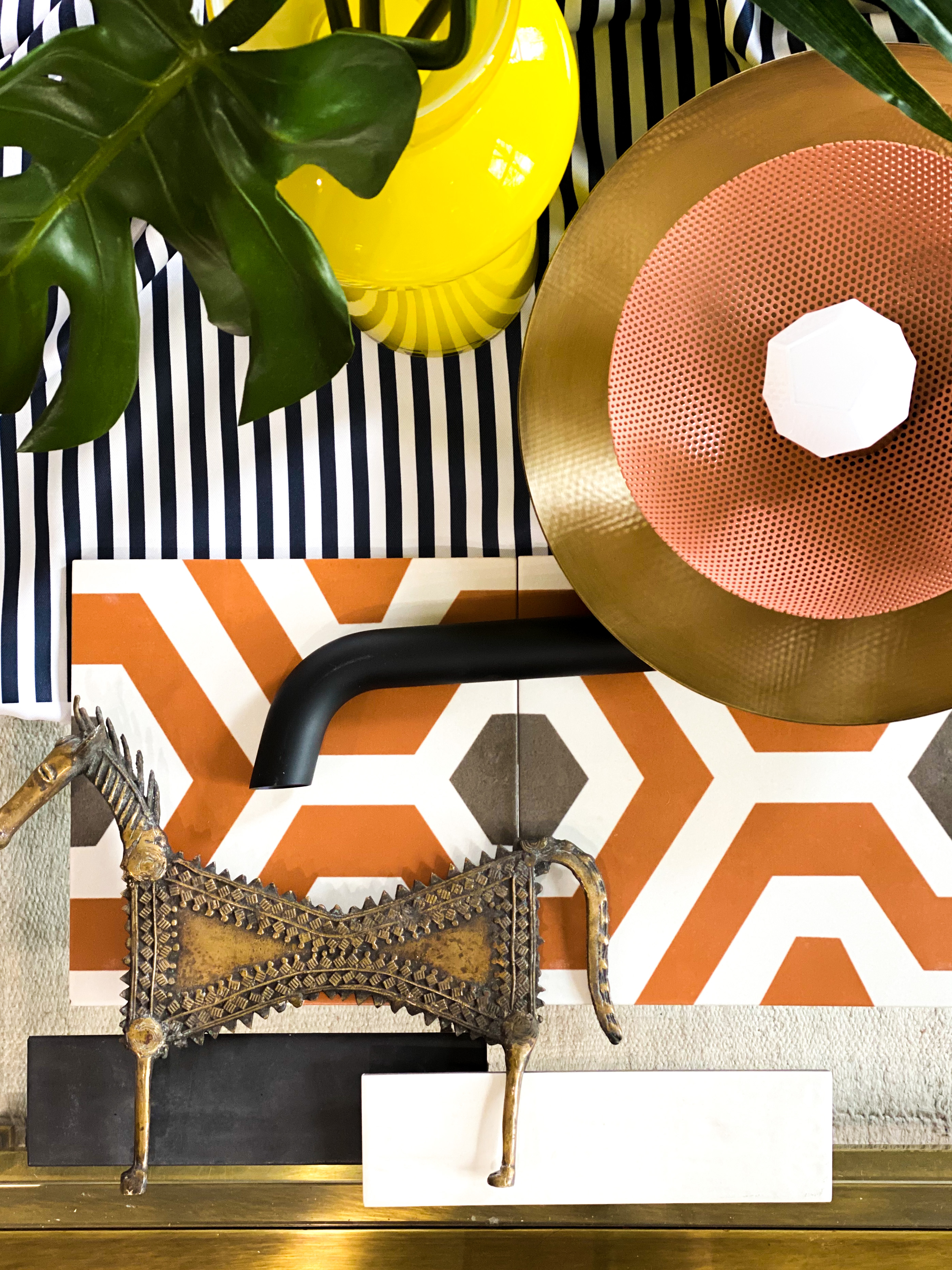
It probably comes as no surprise that my vintage-loving self has long-dreamed of owning a clawfoot tub. They are just a classic nod to the past, but I loved how this particular tub by Signature Hardware assigned a more modern flair to the traditional clawfoot with it’s sleek silhouette. I was so incredibly excited to team up with Build.com + Signature Hardware for this bathroom renovation. The bathroom will be built using MANY products available at Build.com and I love the idea that – for possibly the first time ever – you WILL be able to click on the items in a space of mine and purchase whichever item your heart desires. But, back to the tub. I was infatuated with nearly all of Signature Hardware’s tubs, but was forced to narrow it down based on which tubs were made of acrylic instead of iron. Why, you ask? Because how much weight we were adding the the attic bathroom has been a matter we have been keenly in tune with throughout the process and we were concerned about adding the weight of a cast iron tub (not to mention the difficulties of getting the tub to the third floor). I ultimately decided to go with white for the tub (after much deliberation) because I wanted to color pop in this space to be on the floor.

The other impetus behind choosing white for the tub had to do with the chandelier that would hang above it. This bold black Lotus chandelier from Hudson Valley Lighting Group will delicately hover above the tub and will pick up the charcoal hues in the Artisan Tiare tile from The Tile Shop that will cover the entirety of the bathroom floor (including the walk-in shower floor). The tub is such a statement on its own, and combined with this bold floor tile and bold chandelier, I felt that adding color to the tub would take this curated look from audacious to outrageous.


The bathroom had two dormers added to it (a process highlighted on my Instagram stories this week). One side will host a walk-in shower with The Tile Shop’s Color Market tile in Santorini (white) in a herringbone pattern. The floor of the shower will be done in the Artisan Tiare tile from The Tile Shop. The shower will also host fixtures from Build.com X Signature Hardware. I chose all matte black fixtures to stay consistent with the matte black fixtures that will be found in the other areas of the bathroom, and I love how the matte black pops against the white tile. The walk-in shower will have the Lowden Rainfall Showerhead from Signature Hardware at the peak of the angled ceiling, and the Matte Black Lowden Handheld shower will also be placed in the walk-in shower. Frameless glass Kohler shower doors will serve as the entry to this space. While I love the look of black framed glass shower doors (as seen in this gorgeous bath from @placefortyeight above to the right of my bath moodboard), I wanted the entry to this space to feel seamless and decided to dispense with that idea and go with entirely frameless doors from Kohler/Build.com.

The other dormer on the opposite side of the bathroom will host the bathroom sink and a credenza from APT2B to hold towels and other bathroom essentials. The Centric Sconces from Blueprint Lighting NYC will be flanking the mirror above the sink, and the sink itself will be the Springs Oval Marble Vessel sink from Signature Hardware X Build.com. We will be constructing our own bathroom vanity using vintage library card catalogs I was able to source through Facebook Marketplace. And the tile in this space will also be Color Market from The Tile Shop, but the catch is that this space will have the Color Market tile in the Cosmos (charcoal) color. I had a really hard time choosing whether to use the white or the black Color Market tile for the space, so I decided to take a bit of a design risk and choose both! They will be at opposite ends of the space. The white will be used in the windowless dormer of the shower space to brighten it up, and the darker color is really my favorite of the two, but will be used in the dormer with a window. I felt that using the black in the windowless shower space would create a claustrophobic-type shower experience and that was far from the feel I was trying to achieve.

The one last product I’d like to touch upon is the Candy Stripe fabric from Milton & King. I am still undecided as to whether I will use this fabric in the Office Guest space as Roman Shades, or whether I will use it as Roman Shades in the bathroom. I am waiting for the last bathroom window to be installed to decide. We have been a bit unsure about where the picture window behind the tub will be placed and I want to make sure that the chandelier from Hudson Valley Lighting Group will fall above the window and not directly in front of it. If it will fall directly in front, I will opt for the Candy Stripe fabric to go in the guest space. Regardless, I am very excited to see this fabric appear in our One Room Challenge space!

In the coming weeks, I will be focusing on some of the finishing touches for the bathroom space that will include pieces from Emtek, Jill Rosenwald, Legrand, and possibly Overstock. As always, head over to Instagram to check out my stories that will feature video footage of the design and building process. Seen above is one of the rare instances my husband allowed me to work on the building process. He tends to get very possessive of these projects and I often have to beg to be able to lend a hand, but I’ll be back on the scene soon to help with tiling, and to serve the role of painter (the one job that is always delegated to moi).
And before then, be sure to check out all of the kick-ass spaces being transformed by the 19 other Featured Designers for the Spring 2020 One Room Challenge! Of course, tune in tomorrow for more dreamy spaces from the Guest Participants. There is just so much inspiration to be consumed this season!
A Glass of Bovino | Beginning in the Middle | Beth Diana Smith | Clark + Aldine | Coco & JackDeeply Southern Home| Design Maze | Dwell by Cheryl | Erika Ward | Home Made by Carmona | House of Hipsters | Hunted Interior | Kandrac & Kole | Kate Pearce | Katrina Blair | Liz Kamarul | Veneer Designs| Rambling Renovators | Renovation Husbands | Studio Plumb | Media BH&G
Until then, stay safe, well, and inspired.
XO,


love it kate!! bold colors and graphic patterns. good luck with the window install and see if the stripes work in the bathroom. A clawfoot tub… jealous!!
Thanks so much Tim! So excited to finally have my clawfoot tub!
This is going to be the perfect mix of bold and peaceful retreat. Love the color palette!
Thank you so much Rebecca!
[…] week I did a run through of the design plan for the bathroom portion of our ORC. Click here to catch up. This week, I want to tackle the design plan for the Office/Guest Room portion of our […]