Some items/links in this blog may be sponsored and I may make a small commission if purchases are made through links in this blog. I do attempt to be explicit about which of these links are sponsored, and which are not.
If I had to name one thing that defines every space I design, it would hands-down be vintage. But designing kitchens, laundry rooms and bathrooms around vintage can be tricky. The first reason being that antique and vintage fixtures and appliances are often not energy efficient. While saving tables and beds and sofas from the landfill can be a carbon-conscious choice, reusing an old gas stove or an inefficient refrigerator can have the opposite effect.
Aside from the energy inefficiency of old appliances, it can also be difficult to salvage cabinets that are likely not the right dimensions for your kitchen, or to reuse counters that are, again, unlikely to fit the needs of your space. In the past, I have found incredible pulls and knobs to reuse for spaces (hello, speakeasy!), but even they can be challenging to find enough of if you have a lot of cabinetry. So, how did we incorporate the old into this very new space? Well, we had to get a little creative…

VINTAGE
I always say to start designing a space with either the most difficult thing to source, or the most expensive piece to buy. Sometimes, those things are one-and-the-same…but not always. With this kitchen, I started out with the marble. I knew I wanted something boldly veined and eye-catching and I also knew the marble was likely to be the most expensive line item in the entire kitchen (I wasn’t wrong).
Kitchen Island
So, after I settled on the Paonazzo Rose marble, I then turned to the most difficult thing to source. I knew I wanted to turn an antique work counter into a kitchen island, and I also knew this wasn’t going to be an easy endeavor. Sure, if I had all the money in the world it would’t have proven too difficult. But to find a piece with the right aesthetic, enough storage space, the correct dimensions and wasn’t going to bite into half of my kitchen budget was not an easy task.
It took me around two months of daily searches of multiple secondhand sites and venues to finally find the right piece, and that piece happened to be in France. While I didn’t love the idea of spending an arm-and-a-leg on shipping, I found the antique work counter early enough in our renovation process that I was able to pay 1/3 of the regular shipping price because I was willing to wait 16 weeks for delivery. The shipping was still $1500, but for a piece of this scale and weight coming from France, I thought that was a really good deal. Plus, the worktable itself was $3200, coming in at a much lower price than plenty of the stateside pieces I was considering. This is all to say, don’t count Europe out when searching for the right piece. Sometimes the overall price will be even lower than a piece you might find down the road at your local salvage warehouse.
So, where did I finally find it? From this shop on Chairish.

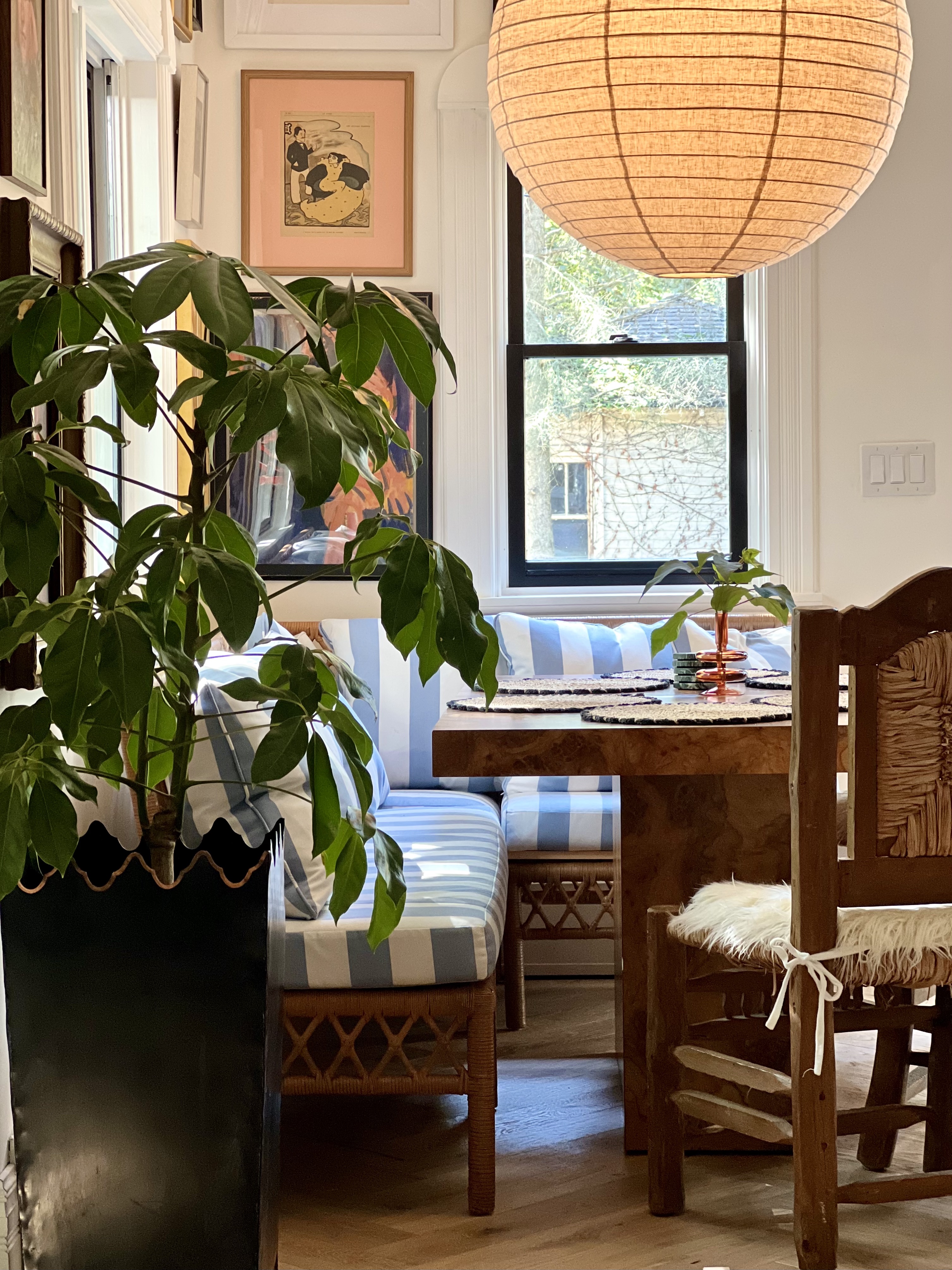
Kitchen Chairs
Originally, I wanted to source all vintage seating for the kitchen. In our last kitchen, I found fabulous Marcel Breuer-style cantilever counter stools for a great price, and there are so many great vintage counter stools out there. But, ultimately, my longterm crush on these Rachel Donath Wave Counter Stools was just too strong to turn down. Instead, I was determined to find vintage kitchen chairs to add some old-world charm to the space.
I knew I needed at least three chairs, but ideally a couple of more to keep hand for when we expand the table for extra guests. As with anything vintage, once you need more than one or two that match, the search becomes exponentially more difficult. Well, one day I was perusing my Instagram feed and happened to see the (pictured above) vintage Mexican, handmade chairs in My Modern Oasis’ feed. I couldn’t find them anywhere on their site for sale, so I shot them a message and asked if they were for sale. “No, but we’ll sell them to you” was essentially their response. And they gave me a really fabulous deal for these really fabulous chairs ($195/chair).
Kitchen Table
A lot of people have been asking if we have two burl wood tables, or if we simply moved our old dining room table into the kitchen. Well, the answer is we don’t have two. We won’t be using our dining room as a dining room any longer (more on that exciting 2024 project coming soon!), so we decided to repurpose one of my all-time favorite Facebook Marketplace scores. I found this burl wood veneer table on FBMP shortly before moving to Chicago. It was located in Brooklyn and the previous owner had said she sourced it from a local vintage shop for a much higher price than what she sold it to me for ($600), but that the dimensions were just not good for her space.
Art & Kitchenware
Beyond the kitchen chairs, table, and antique work counter, we’ve added a lot of vintage charm to the kitchen by including lots of antique and vintage art, kitchenwares, and decor throughout the space. Though this space is much lighter on vintage than most spaces I design, it still feels like it has that old world aesthetic through the use of classic materials, such as honed marble, rattan lampshades, and French Antique cup pulls.

APPLIANCES
The real showstoppers of the kitchen are definitely our Bertazzoni appliances. I have been trying to find the right project to work with Bertazzoni for years, because my crush on everything Bertazzoni is both long-lived and very real. So you can imagine how over-the-moon I was when Bertazzoni came on board as an official sponsor of our kitchen project.
Bertazzoni is a family-owned Italian company creating some of the most stunning bespoke appliances on the market today. Because Bertazzoni, as a company, is not scaled to the same extent of some of their competitors, Bertazzoni might not be the household brand name that it very much deserves to be. All of that is to say, if I am your introduction to Bertazzoni, you can thank me later.
Because I would really like to do a deep-dive into each of the Bertazzoni appliances, I am going to add a fifth blog to this blog series on the kitchen renovation that will focus solely on these beautiful bespoke pieces. For now, if you’d like a glimpse of the Heritage Series line that will (very soon) be installed in our kitchen, check them out through this link.
PAINT
If you’ve been around these parts for a while, you’re probably well aware of my infatuation with Farrow & Ball paint. So, from the very beginning I was set on using Farrow & Ball in the kitchen for the walls and the moulding. The question was, what color?
A couple of years ago I proposed a poll on my Instagram Stories. I asked everyone if they thought I used white paint in my spaces (without peeking). The vast majority in the poll responded, “no.” I then gently pointed out that, while plenty of my spaces included wallpaper, nearly all the paint in my home was white. Our attic bathroom, bedroom, and living space, Eva’s room, the kitchen cabinets, the dining room, the hallways, the staircase, the entryway and our sunroom were all coated in white paints. The reason why people don’t notice the white is because I use the white as a balance to all the other (more eye-catching) colors.
Now, in this new home, I have been embracing a lot of bold colors on the walls. Much more than I had on Long Island. But I think especially because there is so much bold color throughout the walls in the other rooms of our home, I really wanted to tone it down a bit in the kitchen. Especially because I opted for saturated blue cabinetry and pink counters (yes, that marble is quite pink!).
I also wanted to make sure the white was soft and warm. I think the design world at large is really leaning into warm whites and away from pure/neutral or cool whites, but I also think a warm white was definitely the right call for this space, to play off of that warm Paonazzo Rose marble. I am really very happy with how Farrow & Ball’s Wimborne White looks in this space, and after a slight nudge from the team at F&B, I decided to opt fo their new Dead Flat finish. My original hesitancy is that, usually, matte paint is quite difficult to clean, but they assured me that the Dead Flat finish is highly washable (and they weren’t wrong). I slathered the entire space in the Dead Flat Wimborne White, including trim and ceiling, and I love the clean, modern aesthetic if offers. (Note: the paint was sponsored by F&B).

LIGHTING
We are very grateful to have teamed up with Hudson Valley Lighting Group for this space, and have been getting so many compliments on these stunning lighting fixtures. But before I divulge the exact products used in the kitchen, I’d first like to offer some tips and considerations for sourcing lighting for your own kitchen:
- DON’T BE MATCHY MATCHY. A lot of lighting will offer the same line in sconces, chandeliers and pendants, but choosing all the same line for all of your lighting needs can lack dimension and interest. Opt for complementary, but not exactly the same style/make throughout.
- CONSIDER SCALE. Especially when it comes to over-island pendants. While large pieces can make a statement and have a great impact, be sure they won’t interfere with anyone’s line-of-sight (ie. hang them high enough). If you’d rather the eye travel to another element (perhaps a pretty range hood behind the pendants?), then opt for something a bit more muted.
I knew I wanted my lighting to be beautiful, but to not entirely steal the show. Now, that doesn’t mean it has to be boring, it just means I wanted something that doesn’t entirely grab your eye (think, muted tones, or a more humble scale). When I saw the Layton Wall Sconces from Troy (a line offered by HVLG), I just knew they were perfect. The rattan shades lend a casual sophistication to the space, while the hammered, delicately swooping steel arm adds the perfect amount of artistry. While the sconce is undeniably beautiful, the muted tones allow the other design elements around it to breathe.
Since the Layton Wall Sconces were my jumping off point for the other lighting decisions, I knew I wanted to carry that black through to the pendants. Black is such a great tool that I often use in my design tool box, but it’s sometimes tricky to use in a way that isn’t overpowering. I love that the slender cord of the Clivedon Pendant by Mark D. Sikes (and offered by HVLG) carries the touch of black over from the Layton Wall Sconces, while the warm white plays into the Bertazzoni range and range hood. I also love how the interior lining of the lamp is speckled with an antique brass, giving it just the right amount of understated glamour.
The last lighting decision had to do with our breakfast nook. I opted to replace our living room light fixture with another great piece from Hudson Valley Lighting, the Levene Chandelier, and bring our old Terrene Pendant from Jayson Home (in the gravel colorway) to hang over the breakfast nook. I love how the Terrene Pendant adds such a warmth to our breakfast nook, offering exactly the right vibes for dining in the evenings.

FIXTURES
One of the challenges of designing a kitchen in an historic 100+ year-old home is that you want to pay homage to the history of the home, all while still making the design feel modern and current. No where do I find this task more challenging than a kitchen, where modern appliances and gadgets often reign supreme. As mentioned earlier, the Heritage Series Bertazzoni appliances do an expert job at marrying these two purposes, and our fixtures do a fabulous job of it as well.
I’ve long had a crush on everything deVOL and jumped at the opportunity to use their Ionian Tap and their Filter Tap in the kitchen. With their aged brass finishes and gooseneck silhouettes, these fixtures look like they’ve been here forever and, yet, are relevant as ever.
Stay tuned for the last two blogs of the kitchen series, with one focusing on those stunning Bertazzoni appliances, and the other a full reveal of the space (slated for mid-late October). For now, follow along on Instagram as I share the day-to-day updates on stories and the feed!


love it all! we are doing our kitchen soon, watching your process has been very inspiring and affirmative to some of my choices!
Oh I am so happy to hear that! Thanks so much, Jaclyn, and best of luck with your kitchen reno!
Love this can you tell me about the banquette seating?
Thank you! The banquette is from Ballard Designs.
[…] For over the island we chose the Clivedon Pendants by Mark D. Sikes for Hudson Valley Lighting. Why? Read about my why here. […]
[…] https://katepearcevintage.com/2023/09/our-2023-kitchen-renovation-all-the-details-on-lighting-applia… […]