It’s done! And I think the result may surprise you.

This is officially the most neutral space in our entire home, but with good reason. When we renovated our kitchen in the Spring of 2019, we knocked down the wall between the dining room and the kitchen to make it one large, open space. Our kitchen comes with some mega punches of color, from the burnt orange barstools, to the bright Moroccan Knot fabric on the Roman Shades. So, when the wall came down, the bright red rug, pink chairs, and bold wallpaper were 100% fighting with the loud colors of the kitchen. This dining space is also quite open to our moody and colorful library space, as the wide pocket doors are nearly always open between the two rooms. We knew some changes were in order, but it took us nearly a year to tackle them.


Truth is, as much as I am known for color, I do love a space that plays with depth and dimension in other ways. It’s been a fun design challenge for me to make a space that was unique, interesting, layered, and personal with only a few splashes of color. And with the two rooms adjoining this space being quite loud expressions of the color wheel, it just felt right to make this space a bit more serene. An escape from the excitement happening all around it, if you will.

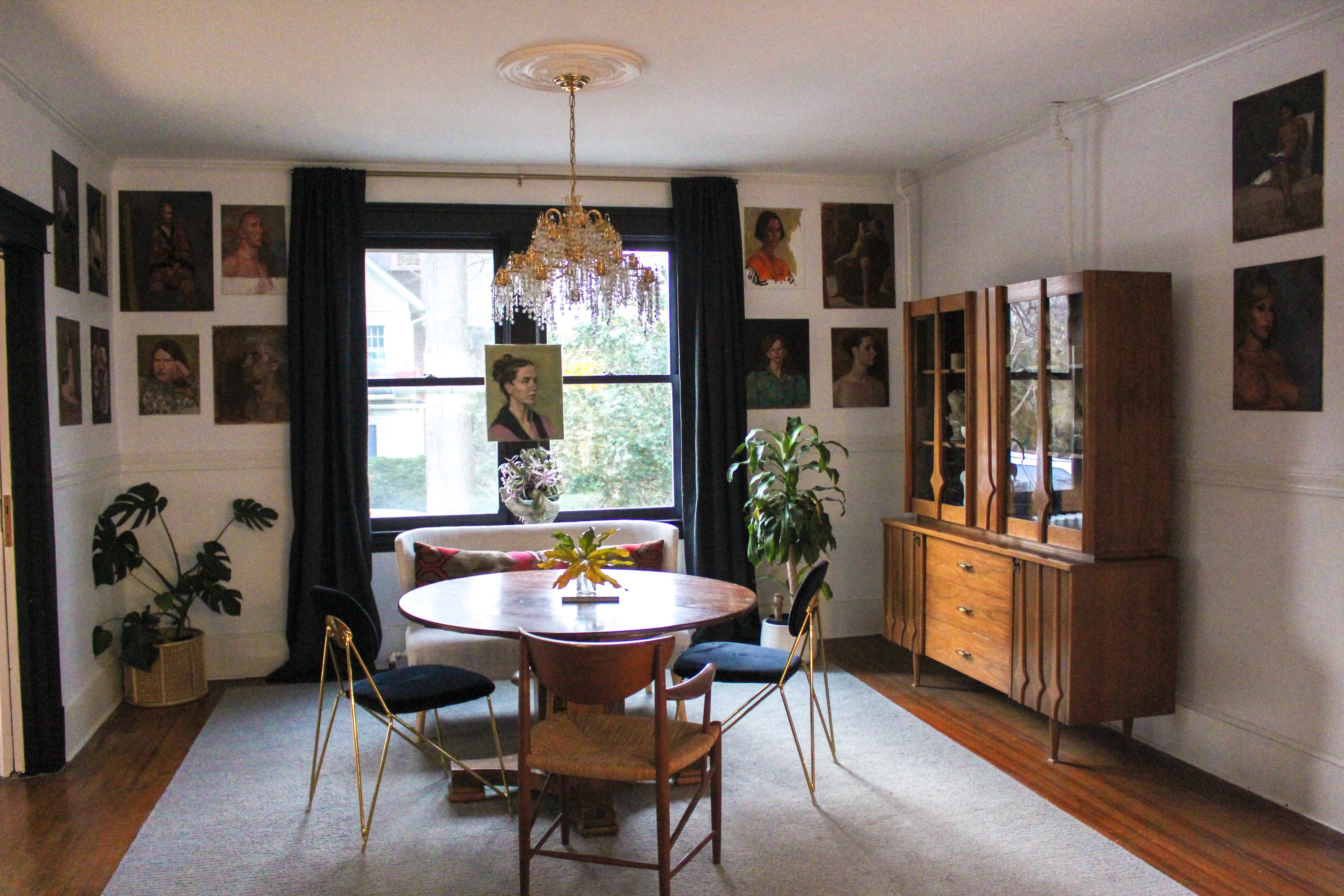
First I’d like to talk budget. Mine was LOW for this room, but I was able to make it extra special with the help from a few sponsors, so I’d like to give them a shoutout. Kimisty Designs sent us the beautiful shelving units hosting our vintage glassware collection. All Modern sent the stunning Danton Upholstered dining chairs. And Josh of Kazimah was kind enough to send an ultra-fun tiger rug my way (though this piece has yet to be added to the space – leaving some surprises for later 😉 ).

We were also able to keep costs low by reusing things we already had in our home. The dining table has been in this space for a long time, and is an antique piece gifted to me by my grandmother. The mid-century curio was a piece from SecondHand Stories that has also been in this space for a long time. The wool rug had been layered under the rug in our library space, so we moved it in here. And all of the curiosities in the china cabinet were already hanging out in spaces around our home. The bar cart, too, had been sourced a local boutique, Sedoni Gallery, last year and is not new to this space, but was given fresh life by mounting the Kimisty shelves above it. The single vintage chair warming up my chair mix was also sourced by moi a long time back, and has been hanging out in my bedroom until now. The large lumbar pillow, too, had been in my bedroom and has been in my home for nearly a decade.

So, what is NEW to the space and sourced for this project? The crystal chandelier was an exciting Facebook Marketplace find that I scored for a mere $150. Selling my old West Elm chandelier that was previously in this space made that a wash. The portraits adorning the walls were found at an estate sale recently. The owner of the estate was a very accomplished artist by the name of Sanford Kossin. I was able to pick up 18 of his original acrylic portraits for $15/piece. The drapes were the only splurge of the dining space, sourced by Restoration Hardware. And that dining bench is……is……..is……. from Amazon [insert sweaty shameful face]. I searched and searched… and SEARCHED for a vintage piece but after two months of having no success, I pulled the trigger on the “imperfect” version of this bench, and was able to score it for 50% off (though it arrived in perfect condition).

Ok, enough about sourcing and just a quick bit about my thinking and goals for this space. I went white with the walls for two reasons: 1. to let those gorgeous portraits be the real MVPs. 2. to bring more light into the space. This is the darkest room on my ground floor, and I was tempted to run with that and make it super moody, but someone on Instagram stories gave me a piece of advice that really stuck with me: “If you eat breakfast in this space, go white. If you eat dinner in this space, go moody.” Well, I eat dinner AND breakfast in this space, but I loved the idea of having a bright spot to sit while I sip my morning coffee (hell, I’m sitting here right now on that bench typing this). And now you’re all like “OK KATE WE GET IT. BUT WHAT COLOR ARE THE DAMN WALLS?!” …. Benjamin Moore’s Decorator’s White. 😉

The other dilemma I was having was about chairs. I LOVE CHAIRS. Especially vintage ones. But I had a couple of design challenges.
- I needed to make a round table work in this space because of the room dimensions.
- I wanted this space to be bright and airy, yet still a bit glam. That chandelier was demanding it.
- I wanted to hide that ugly beast of a radiator.
- I wanted a chair mix. Why use just one silhouette when I could use several?
SO! I used my vintage Peter Svidt rope chair to tie the table into the curio and the antique table, to offer warmth, and to use its airy silhouette to help make the transition from the heavy wood in the space to the more delicate features at the table. Namely, the sleek All Modern chairs and the glam chandelier. The All Modern chairs were selected because the brass legs tie them into the brass cantilevered stools in the kitchen, as they do occupy the same room. I went black to not fight the orange stools, and to also match the sexiness of the chandelier. And the bench at the end allowed me to visually disguise the radiator behind it, while the white linen kept things bright and light. I also loved that the long bench allowed me to add that pop of color and texture with the Moroccan lumbar pillow.

The last thing I’ll speak to is why that curio is stocked with all neutral pieces. Well, I have three explanations, color lovers! The first is that I really wanted the challenge of making the cabinet interesting without color. The pieces occupying the cabinet offer so much textural, historical, and visual interest and I found that leaving color out of the cabinet allowed the eye to focus a bit more on the individual integrity of each piece. The second reason is that I did not want the cabinet to fight the portraits. The portraits are where I want the eye to land first. There are so many of them, and they are the soul of the room. Lastly, I find that cabinets such as these, when used for practical purposes such as hosting plates and cups, can quickly become a cluster fu*k.

So, there you have it! Our kitchen finally feels complete and I am loving how this room plays into the spaces around it. Be sure to head over to my Instagram to check out video of the space, which I think offers a better understanding of how this dining room fits into our home (the video will be on today’s stories, but saved on highlights).
Thanks for coming by to read about our vintage-inspired dining reveal!
XO,


I wish I can wrap my arms around this room and give it a big loving hug!!! Its a vintage dream come true!!
Thank you so much Jamala! That means the world!
Those paintings 😍😍 beautifully done. I especially love the pictures showing into the living room, it shows the breath of calm that the dining room now is. I feel you need plants above the China cabinet though, but I’m a touch overboard in my plant hoarding 🤣
Thanks so much! I’ve tried having plants up there but they always die. The light just doesn’t hit there, but I agree I’d love to have them there too.
Love the insight into your choices. It looks amazing Kate!
Thanks so much Kellie!
Love the chandelier in the dining room. Would love to find one like this, especially for $150! Everything turned out lovely!
Thank you so much!