
This post contains some affiliate links which, if purchases are made through these links, I will make a small commission.
To be honest, I wasn’t quite sure we were going to be able to squeeze in a reveal before the end of 2023 and, though this blog is being published in January of 2024, I was very relieved to have the kitchen complete just before the holidays! We started demolition of our kitchen back in March, and at that time, our contractor said he should be done by the end of June. June, December; It’s all the same, right? So why the major delays? Well, if you’ve ever tackled a major renovation, you’ll know they never happen on the timelines you think they will. For us, we had some major contractor delays, shipment delays, and production of our range took longer than expected (but for good reason! and more on that in a second).
Since this blog is building off the other blogs in the 2023 kitchen series, I am going to break down each kitchen feature to make this blog extra-consumable. If you’d like to know more about demo, my design process, etc., be sure to visit the earlier blogs. I will also add that if you would simply like direct links to everything in our kitchen, I will soon be sharing just the links under SHOP MY HOME, where you can most easily find direct links, without all the “words” that go along with them in this blog.

APPLIANCES
A dedicated blog to our incredible Bertazzoni appliances will be forthcoming in short order, where I really dive into the features of each of them. For now, I want to quickly chat about each of the four appliances:
The Range + Range Hood
I have been getting so very many questions about which appliances we decided to go with and why. There are so many decisions to be made when undertaking a kitchen renovation, but the ONLY thing I was dead-set on from the very beginning was going with Bertazzoni appliances. I have been obsessed with the Heritage Series line for so many years, and mostly because the Heritage Series range makes my heart flutter every time I see it. It’s a timeless, vintage-inspired design that has never, and will never, go out of style.
But, of course, looks aren’t everything! Bertazzoni has such a stellar reputation for beautifully crafted appliances, so the combination of incredible looks and stellar performance made this a no-brainer for us. We decided to go with the Heritage Series 36-inch Induction Range in Avorio, a gorgeous creamy white that will not only be timeless, but will work with any other colors, should we decide to change wall or cabinet colors down the road. We also decided to go with the 36-inch range, instead of the 48-inch. I made this call after living with a 48-inch range in our last kitchen. We never once used all the burners, but did feel the lack of counter space. So, this time around, I opted for more counters, and less range.

I am also very, very excited to be one of the first lucky owners of the newly minted Bertazzoni Heritage Series Induction Range. The move to induction in the market overall has been fast and furious and I am passionately hopping on that induction train. Not only is induction markedly better for the environment, the lack of gas makes them safer. But what about performance? Well, after cooking on an induction cooktop all summer and after doing MUCH research into induction, it seems the consensus is that induction also cooks more evenly, faster and better than gas.
The 36-Inch Wallmount Canopy and Base Hood is such a beautiful piece, too, that is a perfectly coordinated match with the Avorio range. It has power and beauty, and I don’t know what more one could ask of a range hood.
The Fridge
The 36-inch built-in refrigerator is also from the Bertazzoni Heritage Series line, and boasts French doors, and ice-maker, panel-ready front and an internal filtered water dispenser. I have never had such beautiful refrigerator in my life and we have just been really grateful to have this one in our kitchen. Since it is outfitted with an internal filtered water dispenser, that allows the exterior to be panel-ready, blending in seamlessly with the floor-to-ceiling cabinetry.
The Dishwasher
The 24-inch Panel-Ready dishwasher is also part of the Heritage Series line. The panel-ready front also allows this piece to blend in seamlessly with the kitchen design, and I love how very quiet it is while it runs. It has lots of different gadgets and leaves even the dirtiest dishes sparkling clean.
FLOORING
We have also been getting so many questions about our flooring from Divine Flooring and to say I am obsessed with it would be the understatement of the century. In our last kitchen, we went with white oak wood flooring and, though I did love the aesthetic of them, the real wood easily scratched, especially with our dogs and kids. What I love about the Vernazza Herringbone flooring from Divine is that they do, indeed, have a real layer of hardwood on top, and are engineered to be more durable, but definitely not less beautiful, than 100% hardwood flooring.
These floors are also compatible with our radiant heat system that was installed below them and now that it is winter, there is nothing that makes me happier than stepping into our kitchen and onto those floors that are not only so so pretty, but also so so warm and cozy.
If you’d like more information on these very gorgeous Vernazza Herringbone floors from Divine, check out this blog from the kitchen series.

LIGHTING
I think lighting is perhaps the most overlooked element in design. That is something that has always shocked me because, in my humble opinion, lighting is one of the most important elements of a room. Because lighting is so important, it’s usually the decision that takes me the longest. The following is the checklist that I run through my brain before making any final decision on lighting:
- What is the function of the lighting? Do I need task lighting? Mood lighting? Both?
- Do I want to draw the eye to the lighting fixture(s) or do I want them to simply be a complement to stronger design elements within the room?
- How can I create the overall mood for the room with the lighting? If I need task lighting in a space, how can I complement that task lighting with additional lighting that will help me create the vibe I am going for.
- How many bulbs/what wattage do I need to be able to get out of each piece?
- If a shade is on the light, what kind of light will be emitted once the light is turned on?
- What scale does the room need? Is an oversized pendant going to block important viewpoints? Will a flush mount get lost in that high ceiling?
Lighting can really be so complicated, but when it is well-chosen, it can truly be the jewelry of the room. I partnered with Hudson Valley Lighting Group (Troy + Hudson Valley Lighting, to be specific) on this kitchen project and their offerings are both vast and incredible, which didn’t make the decision process any easier. Ultimately, I decided to go with the following selections:
Over-Island Pendants
For over the island we chose the Clivedon Pendants by Mark D. Sikes for Hudson Valley Lighting. Why? Read about my why here.

Over-Counter Sconces
For our over-the-counter sconces we went with the Layton Wall Sconces by Troy Lighting. Why? Read about my why here.
For the breakfast nook area, we decided to move the Terrene Gravel Pendant from Jayson Home from our living room into this space and we are so glad we did. It casts the perfect warm light against the art in this corner, and creates exactly the right mood for dinner at the end of the day. Find the link to the Terrene pendant here.
HARDWARE
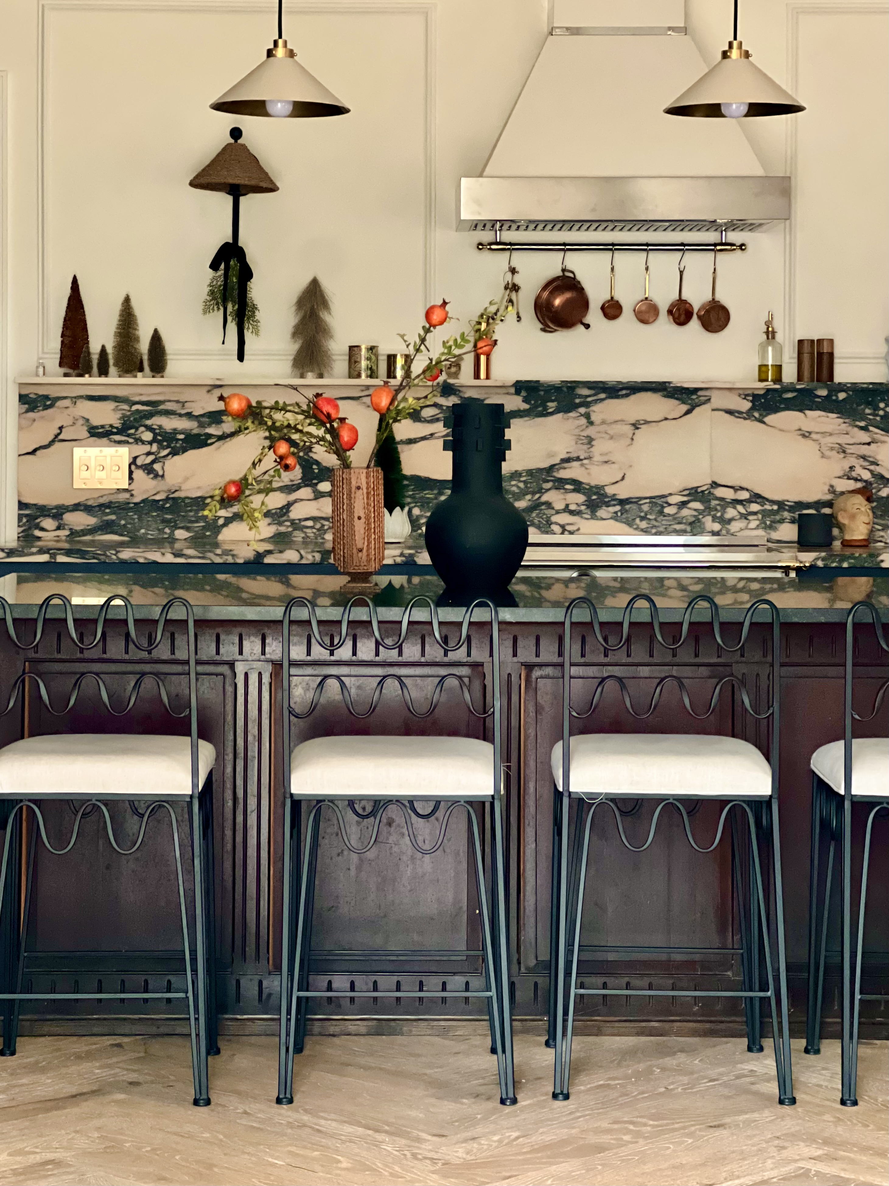
We wanted hardware that would be classic and understated. The marble is such a force, and it needed something to complement it, not fight it. We decided on Emtek’s Providence Cabinet Knobs in a French Antique finish, and the 3″ Cup Cabinet Pulls in the Antique Finish, also from Emtek. This isn’t the first time we’ve used Emtek’s stunning hardware, and it certainly won’t be the last. I truly believe hardware is a place that you should invest in. I’ve bought cheap kitchen hardware before and it breaks, peels and makes the entire kitchen look cheap. Buy hardware that will last a lifetime (or more). In the overall cost of kitchen renovation, high-end hardware won’t break the bank, but it will last forever and it will elevate the entire project.

PAINT
Every single decision in this kitchen leads back to the marble (which is why I almost always tell clients to pick their stone first). I wanted a soft white that would let the marble shine, and Farrow & Ball’s Wimborne White in Dead Flat definitely did the trick. The paint needed to have a warmish undertone as to not feel sterile, but not too warm because those very long, dark Chicago winters need something that will reflect some of that natural light.
As for the cabinetry, we did not paint it ourselves, but instead ordered them directly from Cabinet Joint. The Cabinet Joint color was “Regent Blue,” which is a close match to Sherwin Williams “Naval.”

COUNTERS
I probably should have led with the counters, seeing as they were the very first decision I made for the kitchen (well, after the Bertazzoni appliances, that is), and one of the most-complimented aspects of the design. I think a lot of people are afraid to go bold with counters and, yes, I get it. It’s an enormous expense and you want to make sure you splurge on something that will both stand the test of time and you will not get sick of. But, here’s my pitch for going bold:
There is literally nothing more classic than a boldly veined marble and it takes little more than visiting an ancient ruin or a Baroque cathedral, or an Art Deco building to truly realize that strongly veined marbles have never, and will never, go out of style. As for the lingering question of whether you would get sick of it. Well, everyone is different of course, but nothing gets my heart to flutter faster than a bold marble. That fact has, and will always, be true.
So, what is that marble? It is a honed Paonazzo Rose marble, sourced by T&M Marble Supply Co. and installed by L&G Marble. Both were an absolute pleasure to work with. The backsplash stands 18 inches high, and the shelf five-inches deep. The counters themselves have a mitered edge as to make them look thicker, as the only Paonazzo Rose slabs available were 3/4 inch thick. I will add, also, that every lot of Paonazzo Rose looks very, very different, and many don’t have that gorgeous pink running throughout. If you’re looking to source Paonazzo Rose for a project, be sure to be mindful of the varying aesthetics of each lot.

The kitchen island has a honed Virginia Mist granite. There were many reasons for this decision:
- I originally wanted soapstone without realizing how porous soapstone is. I wanted our island to be a “safe zone” where we could do all the things that our porous marble counters cannot withstand (sloppily drinking red wine, squeezing lemons, etc.) and needed a very hardy stone for these needs.
- Even aesthetically, I did not want to continue the Paonazzo Rose onto the island. I think the eye needs a break from all that bold goodness, and the muted Virginia Mist serves exactly that purpose.
- I do want to add that I ideally wanted a different edging on this slab, but it was one of the last pieces of the kitchen puzzle and, by that point, I needed to save every penny because we went (eek!) over budget.

CABINETRY
In our last kitchen, we went with IKEA cabinetry and, to be honest, they were way better than I expected them to be. But with this kitchen, I really wanted to have high quality wood cabinets that would last for decades (if not longer). I do try to be increasingly mindful of the environment and, for that reason, I wanted cabinets that would stand the test of time. I will be the first to admit that not all of my choices are the most environmentally friendly, but I am always just trying to do better. Of course, keeping our original cabinets would have been the most eco-friendly choice. I actually did want to keep them for that reason. But we opted to donate them instead for a few reasons:
- They were not high quality and were not in great shape.
- There were not nearly enough of them to cover the new kitchen design (and we really needed more storage).
All of that said, we didn’t have an endless budget for cabinetry. I had fallen in love with @probablythis kitchen renovation from last year, so I discovered Cabinet Joint through them, and was very excited to find that the offered the three things I was looking for in cabinets: 1. a wide selection of finishes/colors/styles, etc., 2. quality and 3. easily customizable.
Billy and I do all of our design work. While I take over all of the aesthetic decisions and choose all of the products, color and finishes, the floor plans of our designs are a collaborative process, and Billy is definitely the one to take final measurements of everything (as I have been known to be a bit off occasionally (whoops!). Let’s just say measuring isn’t my thing).

Cabinet Joint allowed for Billy and I to do all of our own designing and then we did have a contact at Cabinet Joint to help guide us throughout the process. Overall, we had a great experience with them and are very, very happy with the final product, which is ordered via Cabinet Joint, but made by Conestoga.
As far as the decisions to go with no uppers, applied moulding doors, and that “Regent Blue” color, well, I guess I’ll break those down for you:
Color
At first I wanted to go with white oak cabinetry, but I also wanted to go with wood flooring. I prefer wood in a kitchen vs. tile for practical reasons (it doesn’t break or crack if you drop stuff on it, and it’s more gentle underfoot while cooking/washing dishes, etc.) and every time I looked at the wood floors with the wood cabinets I just felt that, well, it was too much wood.
So, I pivoted to doing a color and quickly chose “Regent Blue” for how well it complemented the Paonazzo Rose marble. It doesn’t overpower it, but gently complements it in a way that doesn’t entirely secede into the background. It’s not the star of the show, but a very confident supporting actor.
Applied Moulding
This was one of my more unusual choices. I haven’t seen many kitchens with applied moulding cabinet fronts, but I do think it is a classic silhouette. So many kitchens right now are using either slab fronts, or still using shaker fronts and while I do think both of those are classic and beautiful, I wanted to do something a little different.
I knew I wanted to add picture frame moulding above the marble shelf, and I loved that the applied moulding on the cabinet fronts would seamlessly carry the eye from the cabinetry to the upper walls.
No Uppers
We didn’t use uppers in our last kitchen project either, and I had zero regrets. I do think, however, that if you’re going to make this decision you need to consider three things:
- Is your kitchen large enough to compensate for storage/cabinetry elsewhere. For example, we have an entire large wall of floor-to-ceiling cabinetry and a pantry, so the uppers felt excessive/unnecessary and we love how much more open the space feels without them.
- Think about the space that you have and whether eliminating uppers will make sense aesthetically, too. I find mid-sized kitchens to be great without uppers, but small ones might need that extra cabinetry and extra large kitchens might feel a bit empty without them.
- I almost don’t even want to add this one, because I feel as though it’s not even something on my radar, but are you OK with some dust? Why is this question not on my radar? Well, because I only put two types of things on my open shelves: 1. decorative items and 2. daily use items that get used and washed much more quickly than they could ever accumulate dust.

DOORS
We added two doors to our kitchen when during the renovation process and both were a splurge, but I think both were worth it. It is always shocking to see the sticker price on doors and windows and ultimately we decided that if we spent just a bit more, we could have exactly what we wanted for the space (I guess that’s how we found ourselves over-budget? ha!). Even low-end doors and windows are so expensive, so this was a place that just felt like it made sense to go with quality, well-insulated and beautiful doors that will serve this home well for many, many decades to come.
Keeping the door we had wasn’t an option. It was completely dilapidated and probably should have been replaced immediately upon moving in. Upgrading this door was maybe the single-most impactful decision we made with this entire renovation project.
The door is the Air 5 Double Full Arch, thermally-broken door made of steel from Pinky’s. The “thermally broken” feature of the doors was necessary to withstand the bitterly cold Chicago winters. We’ve had temps steadily below 0 degrees here for days at a time this winter, and there was zero draft coming in from these doors. If that is not money well spent, I don’t know what is.
We also decided to carry the black steel theme into the kitchen with the Air 5 with Kick Plate Pantry doors, which are also from Pinky’s and have ribbed glass (there are different options for glass when purchasing).

KITCHEN ISLAND
With every project I undertake, I try to source as many secondhand pieces as makes sense. With kitchens and bathrooms, this can be limited, especially considering that vintage appliances and fixtures can be low-efficiency and have an even harsher impact on the environment.
The island was a place where it made sense to bring in an antique piece. It took me a long time to source, as I needed the island piece to be within a strict set of dimensions, have lots of storage AND be within my price range (so many were not). I was able to source this piece from France via Chairish, and have it shipped across seas, all-in for just over $5,000. I am by no means saying that is inexpensive, but that price actually came in lower than if I were to purchase cabinetry for the island from Cabinet Joint, and this piece adds so much more character to the kitchen than a set of new cabinetry from Cabinet Joint ever could.
Sourcing pieces such as this can take a lot of time, and time is money, as they say! So while this choice made sense for us, it is important to be mindful of the steep time investment sourcing pieces such as this can be. If this is reading as a plug for your favorite vintage dealer, then I have made my point.

FURNITURE
Speaking of vintage! Now, furniture is always a great place to bring it that vintage charm. Our burl wood dining table was sourced via Facebook Marketplace (in Brooklyn, as this piece was purchased shortly before we moved to Chicago). The vintage Mexican wood chairs were sourced via My Modern Oasis (one of my very favorite Chicago vintage shops), and many of the decorative pieces, such as the copper cookware, the pieces adorning the island and the marble shelf, etc. are also secondhand scores.

The new pieces of the kitchen are the Rachel Donath Wave Barstools (I just couldn’t help myself. I tried to talk myself into buying secondhand barstools, but my crush on the wave stools is just too long-lasting and too extreme). The other piece that was sourced new for the kitchen is the banquette. I also tried to source a secondhand banquette, but after months of trying to track one down with the right dimensions, I decided to shift my resources elsewhere. This piece was designed by Suzanne Kasler for Ballard Designs.

SINK + FAUCETS
Last, but not least, are the sinks and faucets. Both the Aged Brass Filter Tap in the coffee nook and the Aged Brass Ionian Tap on the main sink are both from DeVOL. The aged brass finish adds so much character and the gooseneck silhouette is one that will never go out of style.

As for the sinks, the coffee nook has an integrated sink crafted from the Paonazzo Rose marble. The main sink has a white porcelain sink. I opted for the integrated sink in the coffee nook because I knew it wouldn’t be as susceptible to cracks and stains, seeing as it is only used to fill things with filtered water. I initially wanted to add a Paonazzo Rose integrated sink as our main sink, too, but talked myself out of this because of practicality reasons, seeing as it is a porous marble that would be subjected to all the things that go into a main sink.
That just about rounds out the reveal of the kitchen, but forthcoming will be a quick links list of everything in the kitchen (which will be found here in the SHOP MY HOME section of the blog). I will also be detailing the Bertazzoni in a blog to be published in February or March, after having a few months of use under our belt. So far, we are in LOVE.


This is sooo incredibly beautiful! Thank you for sharing soo much details!!! We all appreciate you sooo much! 🫶🏼
Gladys! You are the best. Can’t even tell you how much I admire your talents, and appreciate your support as a friend over the years!